Jesse Rego

Intro

Hello Garrett. Appreciate you taking the time.

I’m a Platform and Systems Designer with about 10 years at Workday, focused on scaling UI architecture across 70,000+ product surfaces.

My work sits at the intersection of design systems, product, and engineering. The throughline is straightforward: reduce fragmentation, increase reuse, and turn platform investments into product adoption.

Technical Lead - Workday Design Council Lead Librarian - Workday Pattern Library UX Organization Educator & Mentor Co-created the UX Platform design role and support process
Conversation frame

What will we be learning today?

01

Operating model

How framework work and embedded product work reinforced each other to create real adoption.

02

Decision lenses

The decision lenses I use to standardize the right things, preserve the right flexibility, and create leverage across teams.

03

System stories

Two examples where local product problems became reusable system models that teams could adopt at scale.

My Role in Platform

I operated as a multiplier across the product suite.

At Workday, I split my time between building frameworks and embedding with product teams to drive adoption. The value of the role was not producing more artifacts. It was reducing fragmentation, introducing reusable models, and making sure platform work translated into real product implementation.

  • Identify fragmentation early, before teams lock in one-off solutions.
  • Define frameworks, patterns, and constraints that increase reuse across product areas.
  • Drive adoption through real implementation, not guidance that sits outside product work.
  • Shape how the system evolves over time, not just how one screen gets built.
Operating model 60%

Frameworks, patterns, and system architecture

Defined reusable models, framework guidance, and architectural constraints that helped teams implement faster with less local reinvention.

Operating model 40%

Embedded product work to operationalize adoption

Embedded with product teams so the system proved itself in real workflows, real constraints, and real shipping conditions.

Platform UX map

How my role connected Design System, UI Platform, and product-wide adoption

Primary Partner

UI Platform

Consumes Canvas guidance and turns it into reusable framework and pattern infrastructure.

98% suite reach Canvas consumer Legacy UI
Feeds product teams.
Home Organization

Design System

My home team and the source of Canvas tokens, guidance, and pattern foundations.

Canvas tokens Patterns
Feeds platform inputs.
Collaborator & Adopter

Product Teams

Consumers of platform solutions in real product implementation.

Student HCM Support Privacy Talent Recruiting Financials Security Learning Extend
How I Work

My work is less about following a standard design process and more about making the right decisions at scale.

In platform environments, the challenge is rarely inventing a new flow. It is deciding where standardization creates leverage, where flexibility still matters, and how to make the system easier for teams to adopt than a one-off solution.

Lens 01

Audit

Find where patterns diverge across product areas and begin creating avoidable complexity for teams.

Lens 02

Align

Decide what should standardize, what should remain flexible, and where the system boundary should live.

Lens 03

Define

Reuse proven primitives when possible so teams can build from the system instead of rebuilding locally.

Lens 04

Adopt

Measure success by adoption, not just by how polished the first implementation looks.

Lens 05

Document

Document the model so teams have a clear path to use it without reopening the same decisions.

Audit Prioritize → Map layout → Deconstruct
Align Deconstruct → Partner
Define Partner → Design / test
Adopt Document / ship
Document Guidance → Ship
Product
Design
Platform
Prioritize

Use roadmap visibility and org signals to target the most meaningful system gap.

Map layout

Identify the relevant pagetype, layout, ownership seam, and product impact area.

Deconstruct

Pull apart the flow into components, layout logic, and repeatable architecture.

Partner

Work with impacted teams so the solution addresses local needs while staying universal.

Design / test

Iterate in product, validate with feedback, and refine the system under real constraints.

Document / ship

Turn the work into adoption guidance, implementation assets, and repeatable rollout paths.

Component
Layout
Page Type
Framework
UIC-Features
WD-C
Canvas
10 yrs
Platform UX experience inside Workday’s design systems and product ecosystem.
70k+
Product surfaces, tasks, and reports shaped by the larger system architecture decisions behind this work.
60 / 40
Framework definition balanced with embedded product work to make adoption real.
Scale
The focus was not isolated UI polish. It was system leverage across design, product, and engineering.
Case Study 01

Forms Framework

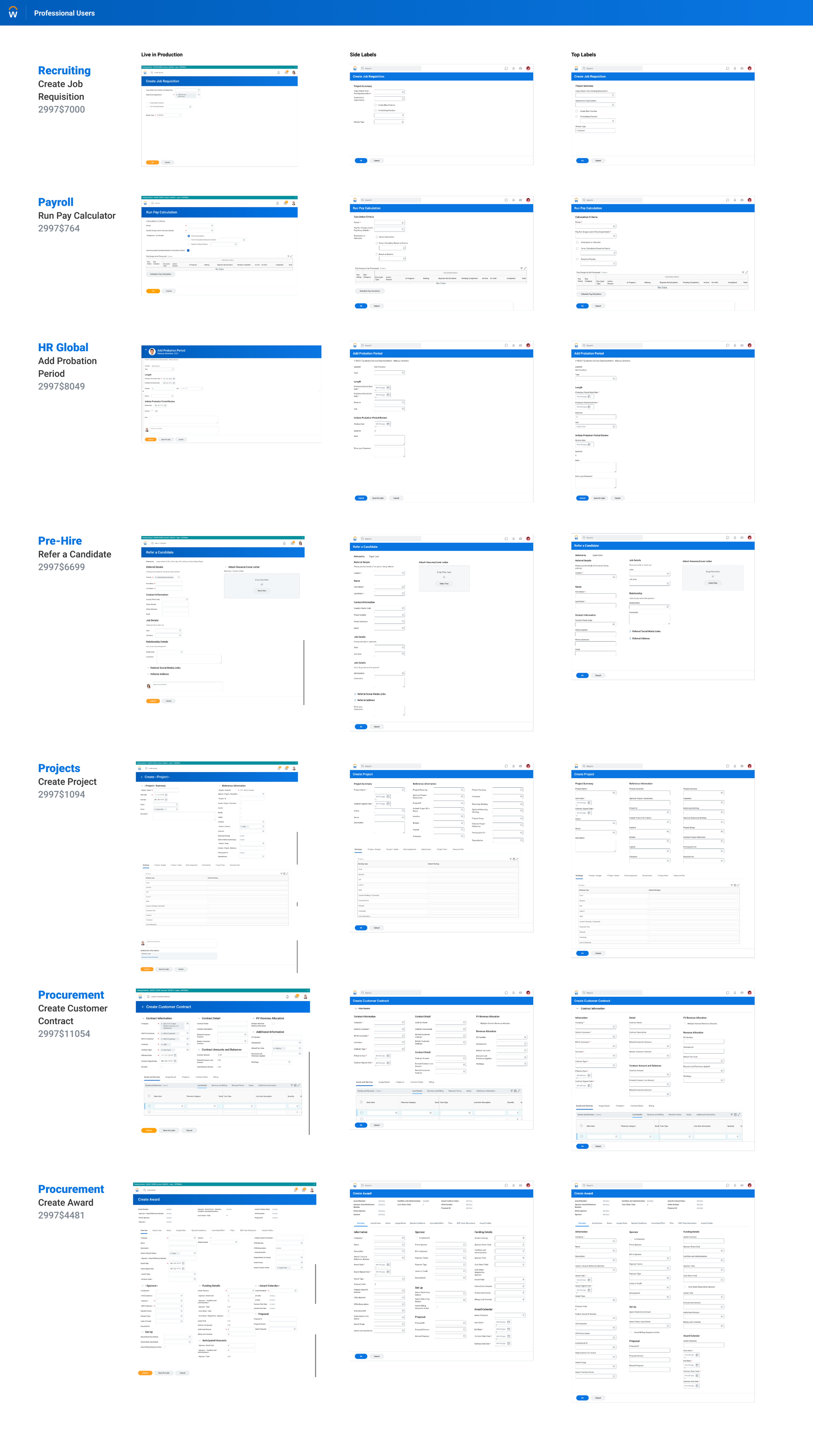
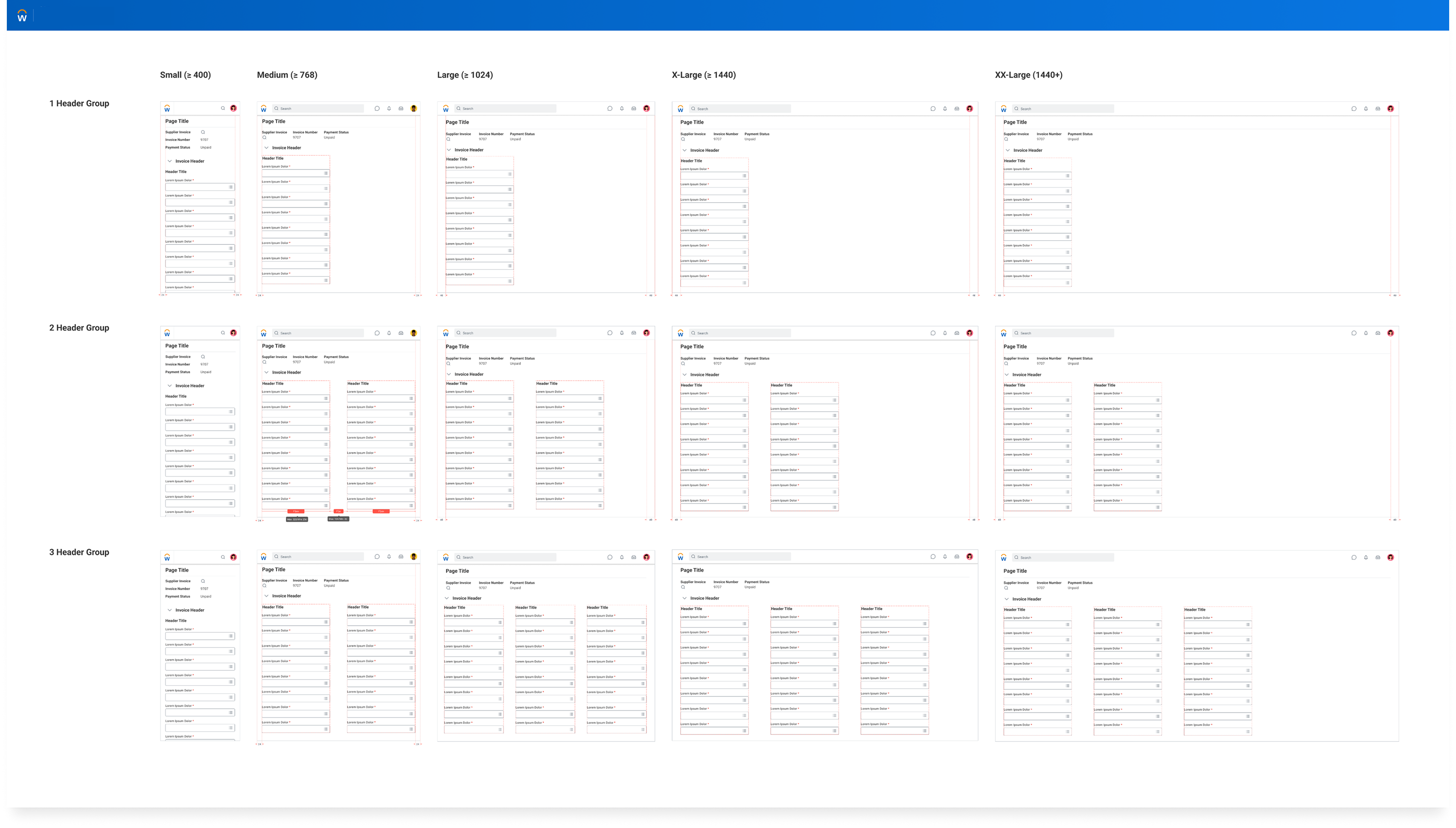
A system-level modernization story: legacy Workday experiences spanned most of the suite, but layout and form structures were rigid, inconsistent, and expensive for teams to solve screen by screen.

Context

Legacy product covered most of the Workday experience

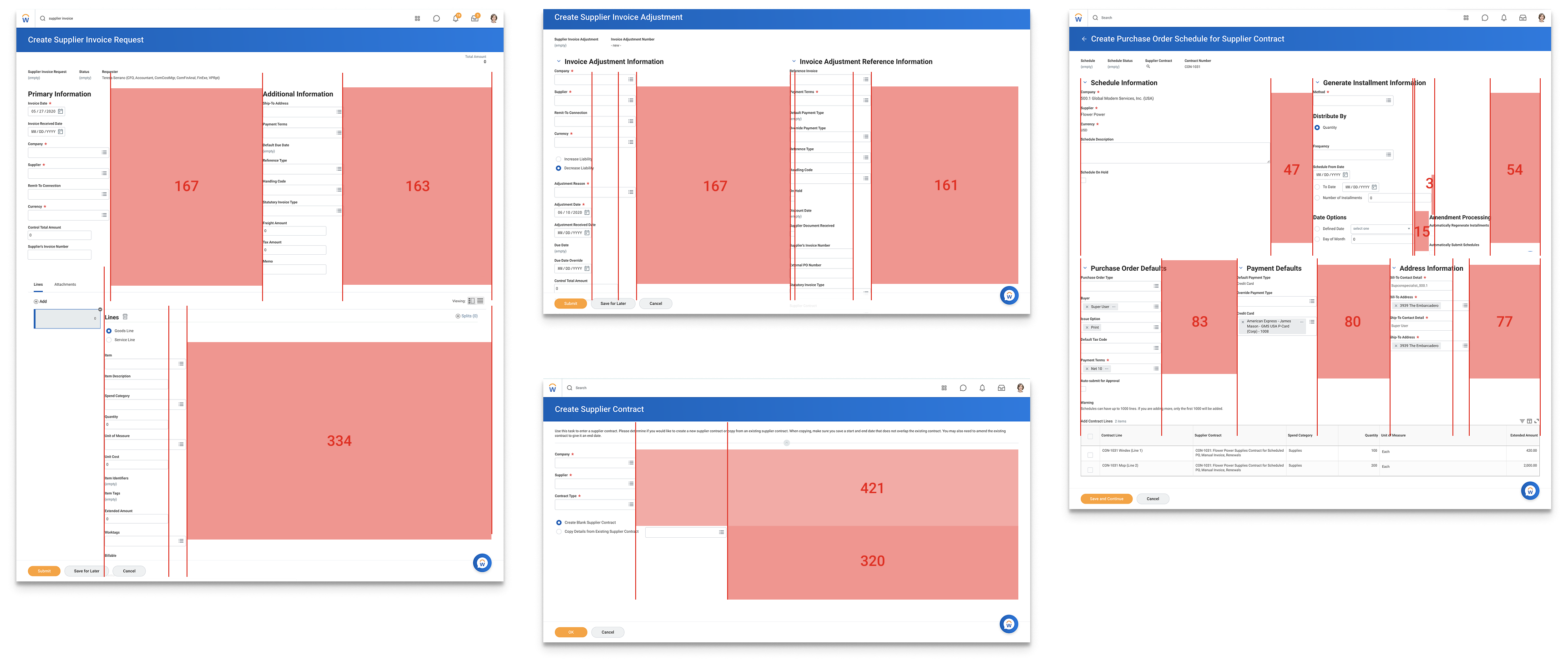
Roughly 95% of product surfaces were still driven through legacy structure, spanning about 70,000 tasks and reports across the suite. Any improvement at the framework level had meaningful leverage.

Legacy form layout showing dense columns and poor responsiveness
Problem

Teams were solving layout locally

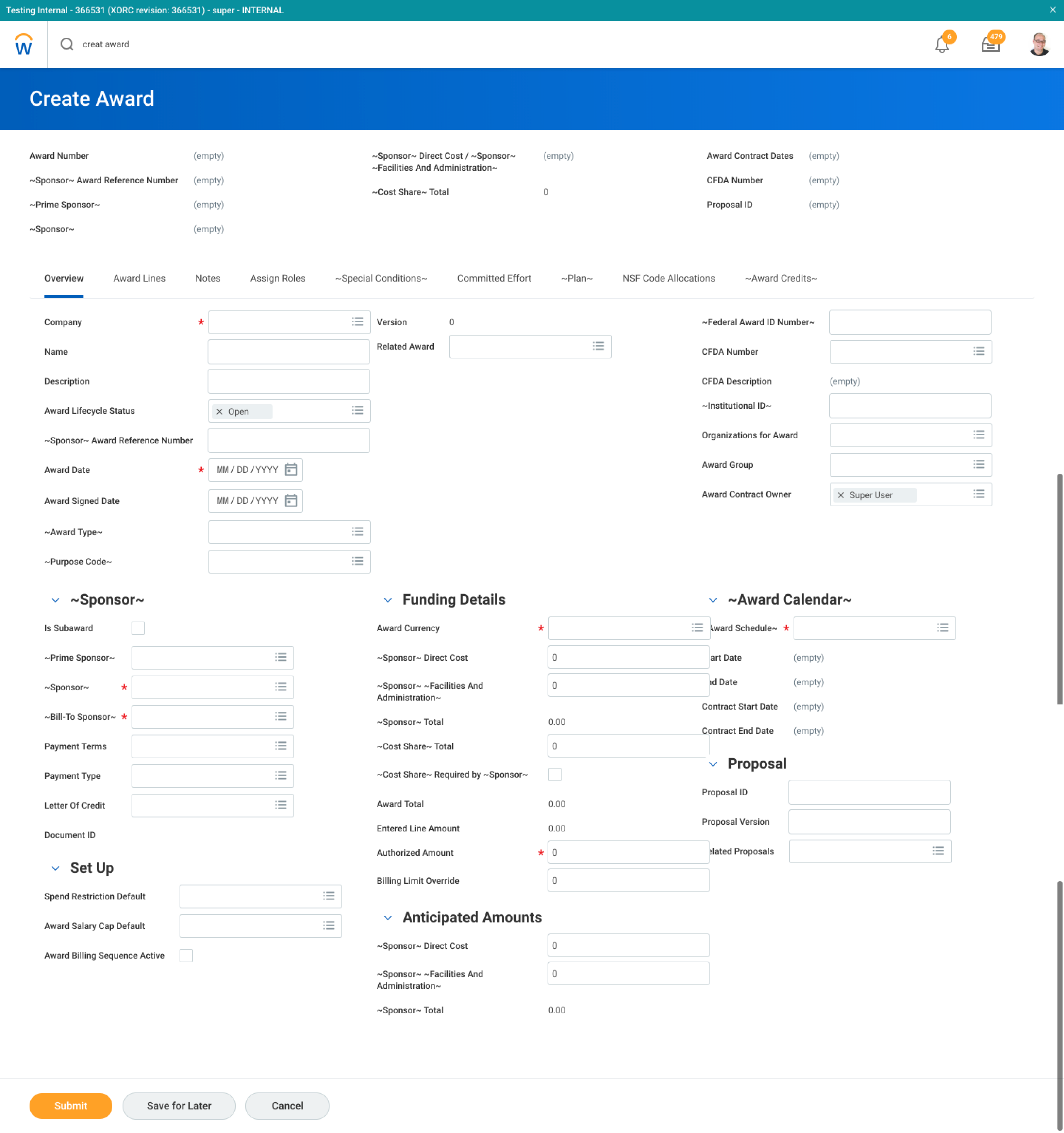
Form structures were inconsistent, rigid, and non-responsive. Teams kept solving layout at the page level, which increased fragmentation and slowed implementation across the system.

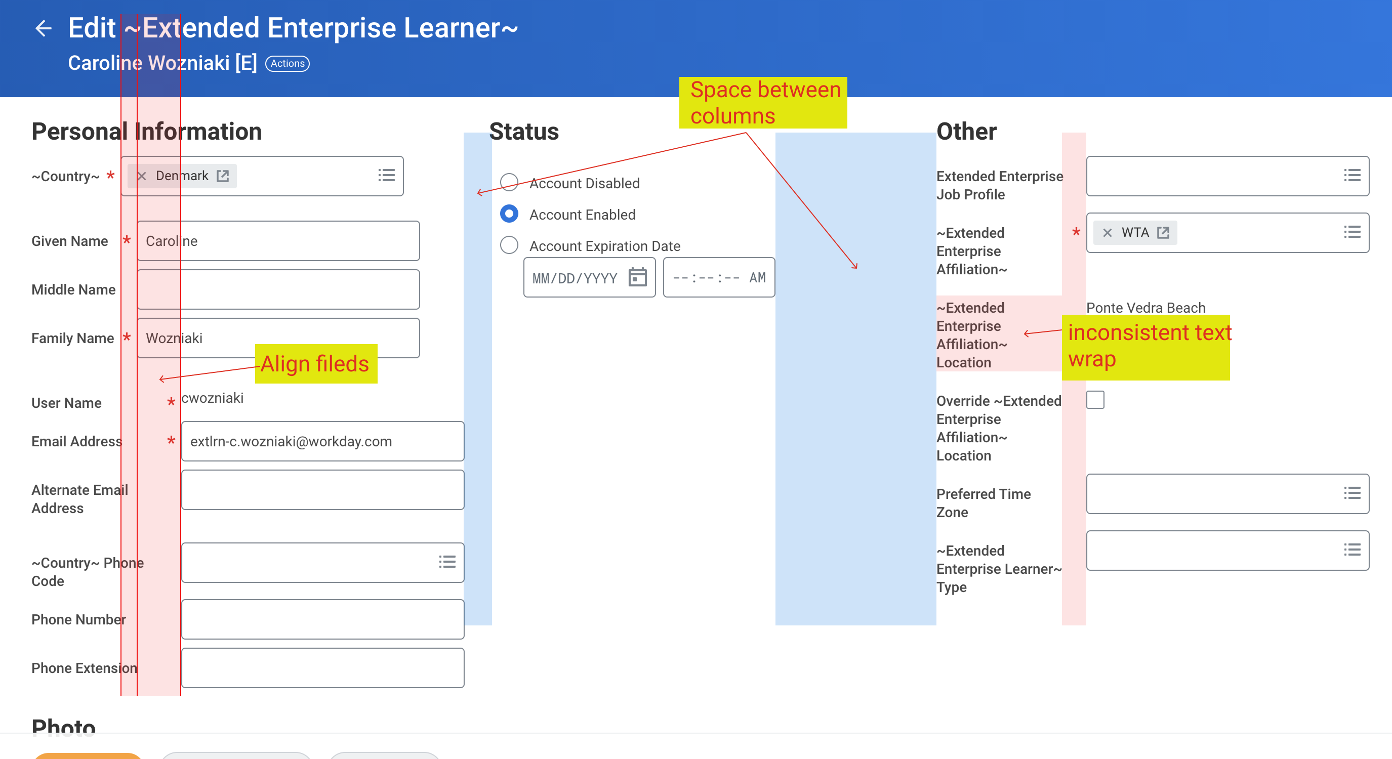
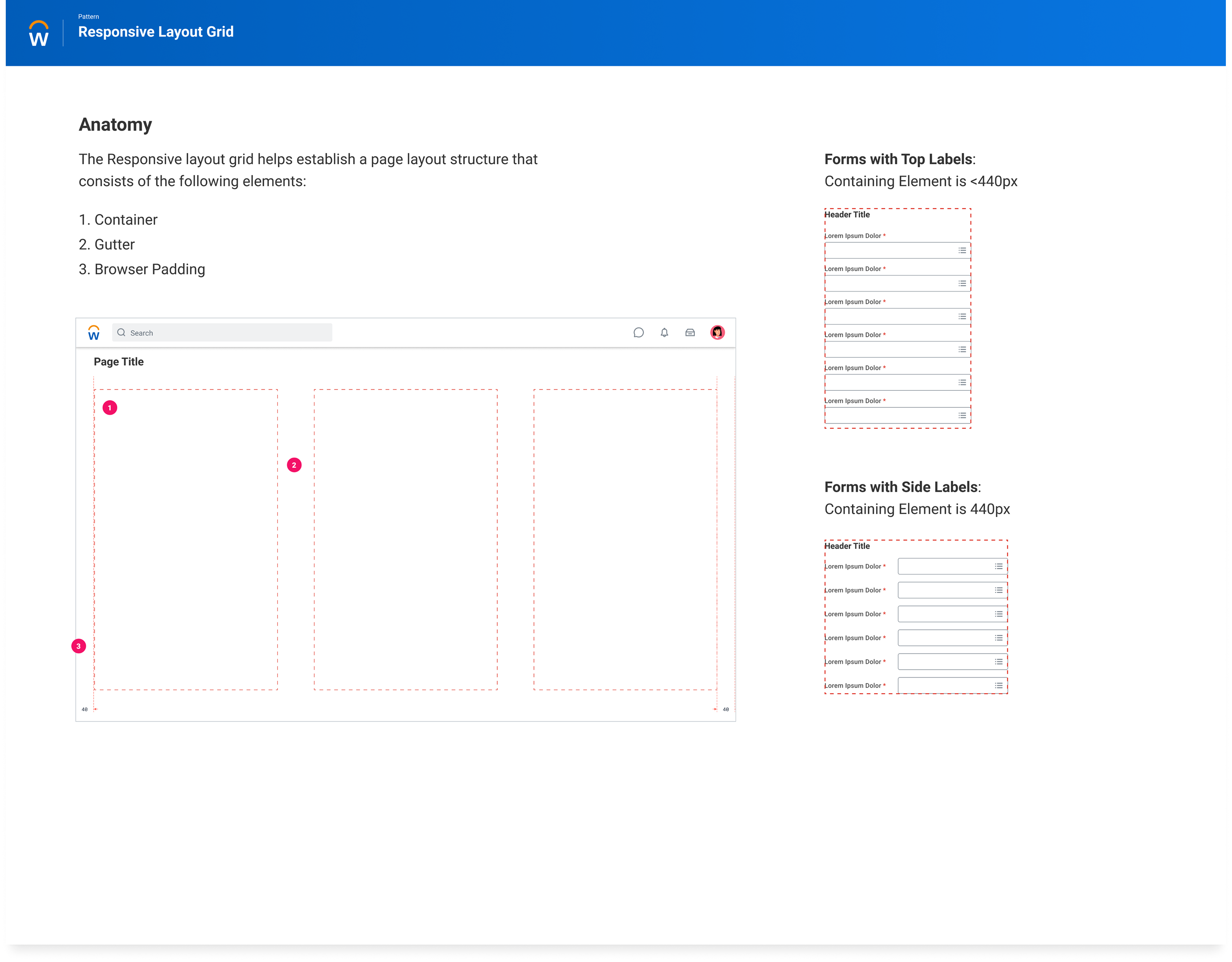
System patternThe issue was structural, not isolated. Layout, spacing, grouping, and label behavior could be solved once in the framework instead of many times in product.

Key Decision

Introduce a new abstraction that could coexist with legacy

Rather than retrofit old layouts one screen at a time, I pushed for a responsive grid framework that could coexist with legacy patterns, reduce one-off fixes, and support gradual adoption.

Solution

Responsive grid plus reusable form structure

The framework introduced shared layout constraints, standardized form patterns, and responsiveness rules that reduced variability and gave teams a reusable structure to build with.

Case Study Walkthrough

How the forms framework moved from problem discovery to a reusable model

Act 1 Discovery

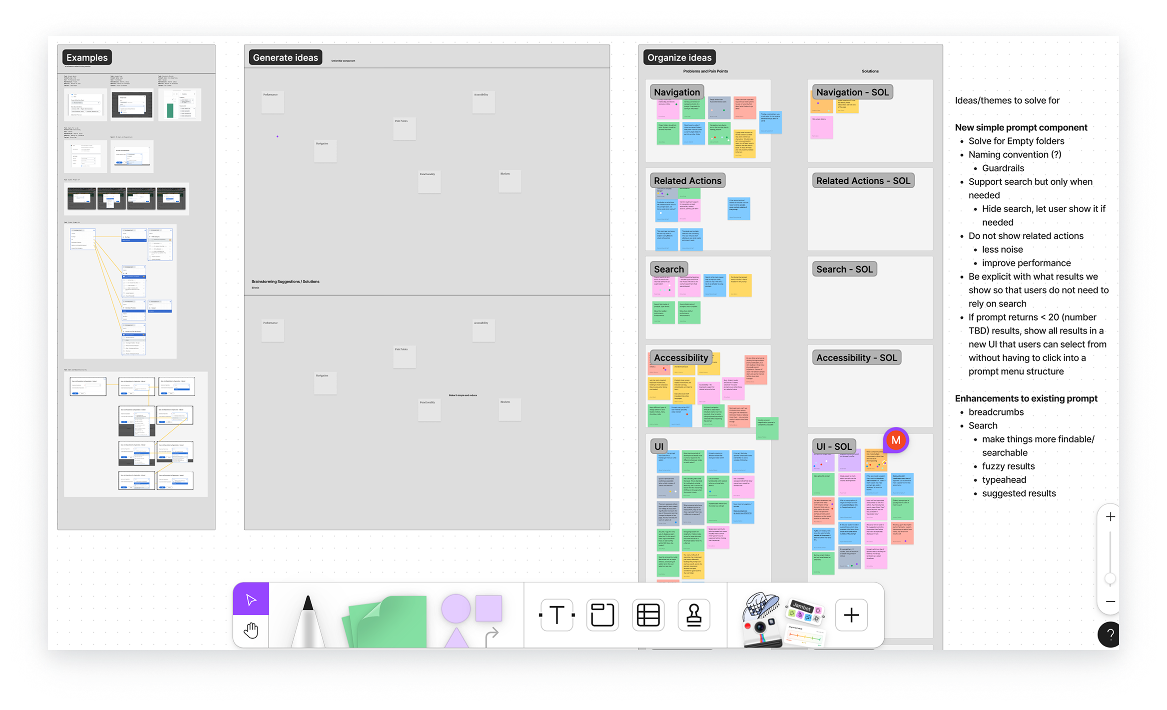
I started by making the problem undeniable in production. The goal was to show that the issue was not one broken form, but a repeated structural pattern across legacy Workday experiences.

  • Audited live product screens to show recurring alignment, spacing, and scanability failures.
  • Framed the problem as a platform issue rather than isolated product debt.
  • Made the underlying constraints visible before proposing a system-level fix.
Identify gaps across form experiences
01 Identify gaps Initial audit of structural problems.
Existing form gaps across multiple product screens
02 Existing gaps Recurring issues across live product screens.
Sub constraints in legacy form layouts
03 Constraints Nested constraints that complicated a simple fix.
Act 2 Framework opportunity

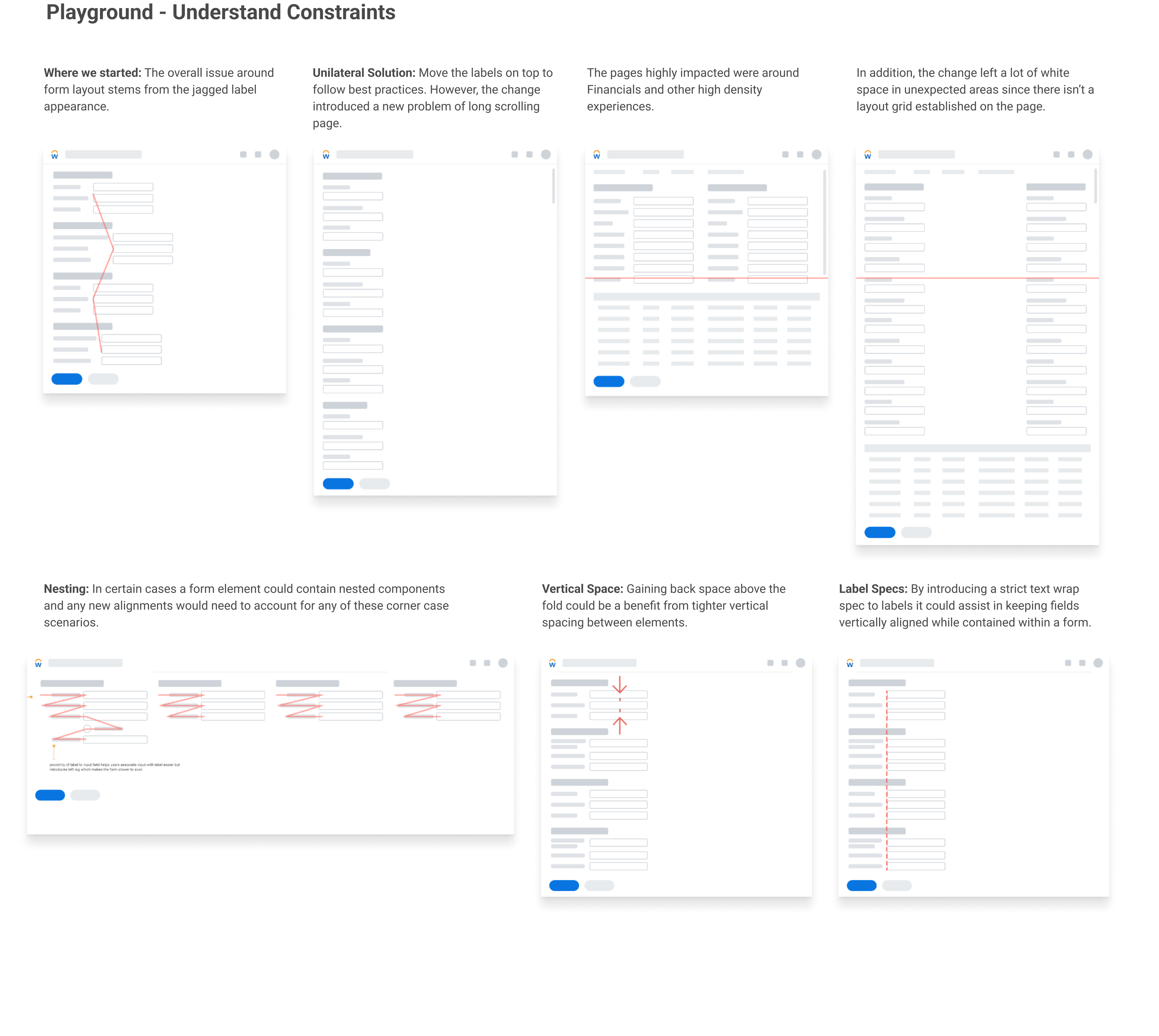
Once the patterns were visible, the next step was to turn the mess into a reusable model. This is where the work moved from critique into architecture.

  • Identified the leverage points where one framework could improve many forms at once.
  • Deconstructed forms into repeatable building blocks and layout rules.
  • Translated that structure into a general specification that engineering could operationalize.
Responsive layout opportunities across form structures
04 Opportunities Where a framework could solve more than one screen.
Form building block specification
05 Building blocks The structural pieces the framework would standardize.
General responsive layout specification
06 General spec The responsive layout model turned into a usable spec.
Act 3 Guidance and adoption

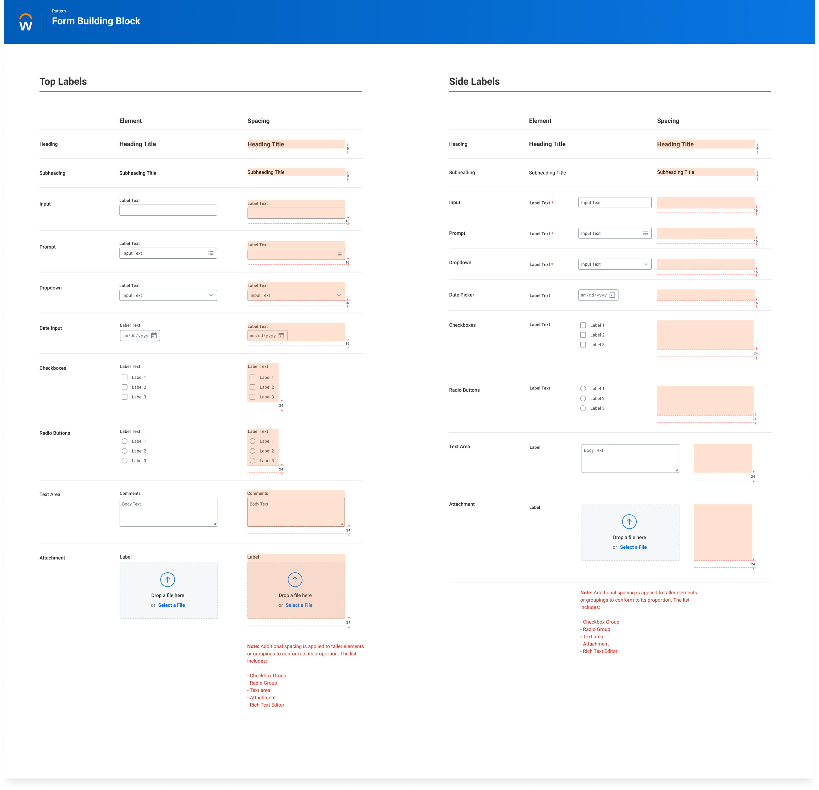
The final step was adoption. The framework had to become usable in real product work, with clear rules for label behavior, wrapping conditions, and when different patterns were appropriate.

  • Documented edge cases so teams could apply the system without re-litigating layout choices.
  • Clarified when top labels versus side labels created better outcomes.
  • Turned the framework into guidance that product teams could actually ship with.
Label wrapping conditions for forms
07 Wrap conditions Rules for label and header behavior under constraint.
Top label specification examples
08 Top label Where top labels became the right structural choice.
Side label specification examples
09 Side label How side labels stayed usable for denser form patterns.
Create Award form showing the dense multi-column structure used in the legacy framework
Create Award as a representative example of the dense legacy structure the framework needed to simplify and make responsive.
Solution details

How the framework translated into system architecture

  • Reframed forms as a platform problem, not screen-by-screen debt.
  • Defined one responsive grid instead of many local layout fixes.
  • Kept adoption incremental by working with existing tooling and APIs.
  • Moved teams from page design to reusable layout architecture.
85%
Of product experience enhanced.
60k
Tasks and reports affected by the broader layout architecture challenge.
1
Shared responsive abstraction introduced instead of multiple local fixes.
0
Toggle go-live paired with a 6 month preview window.
Impact

More consistent structure across thousands of surfaces.

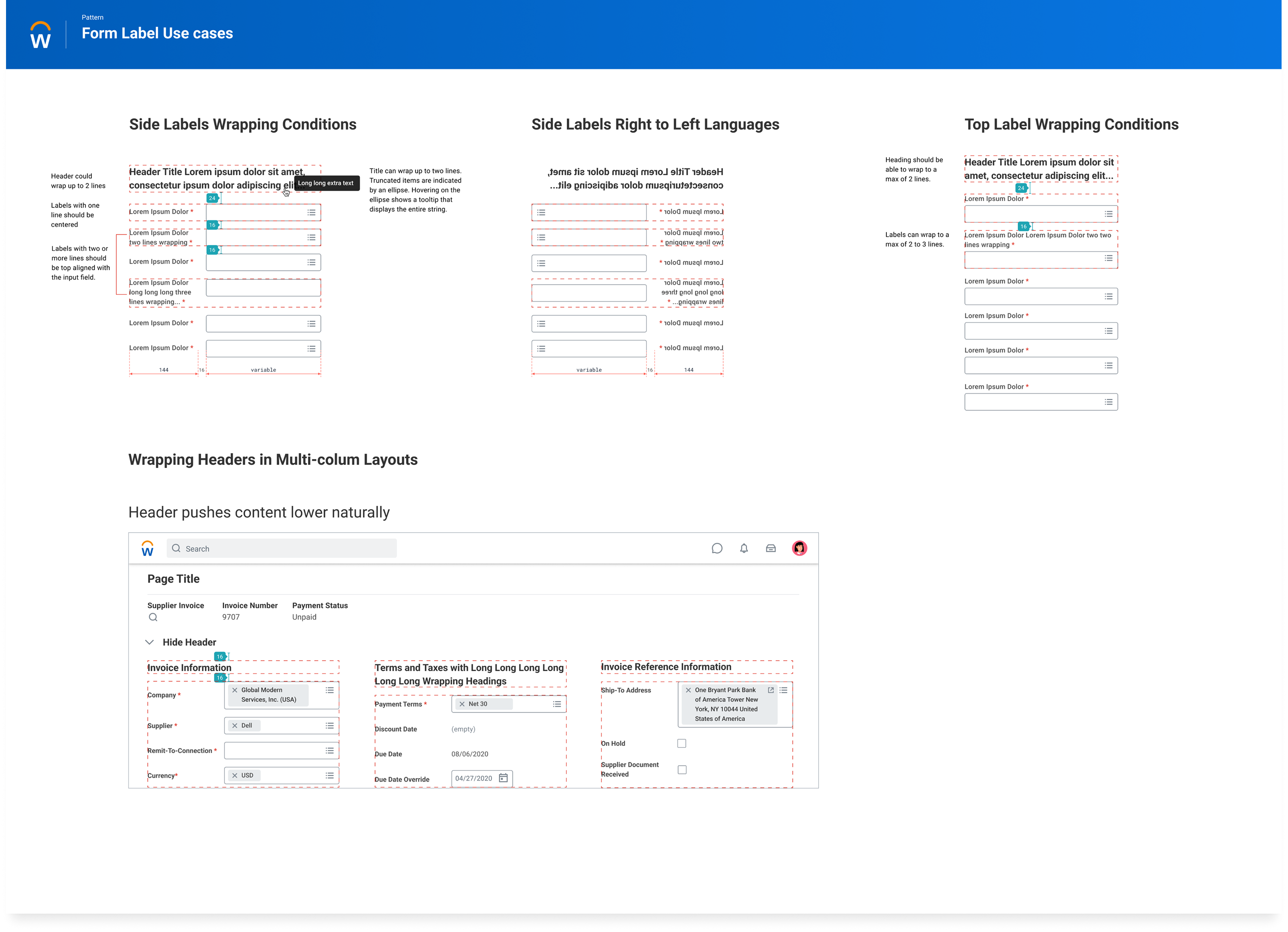
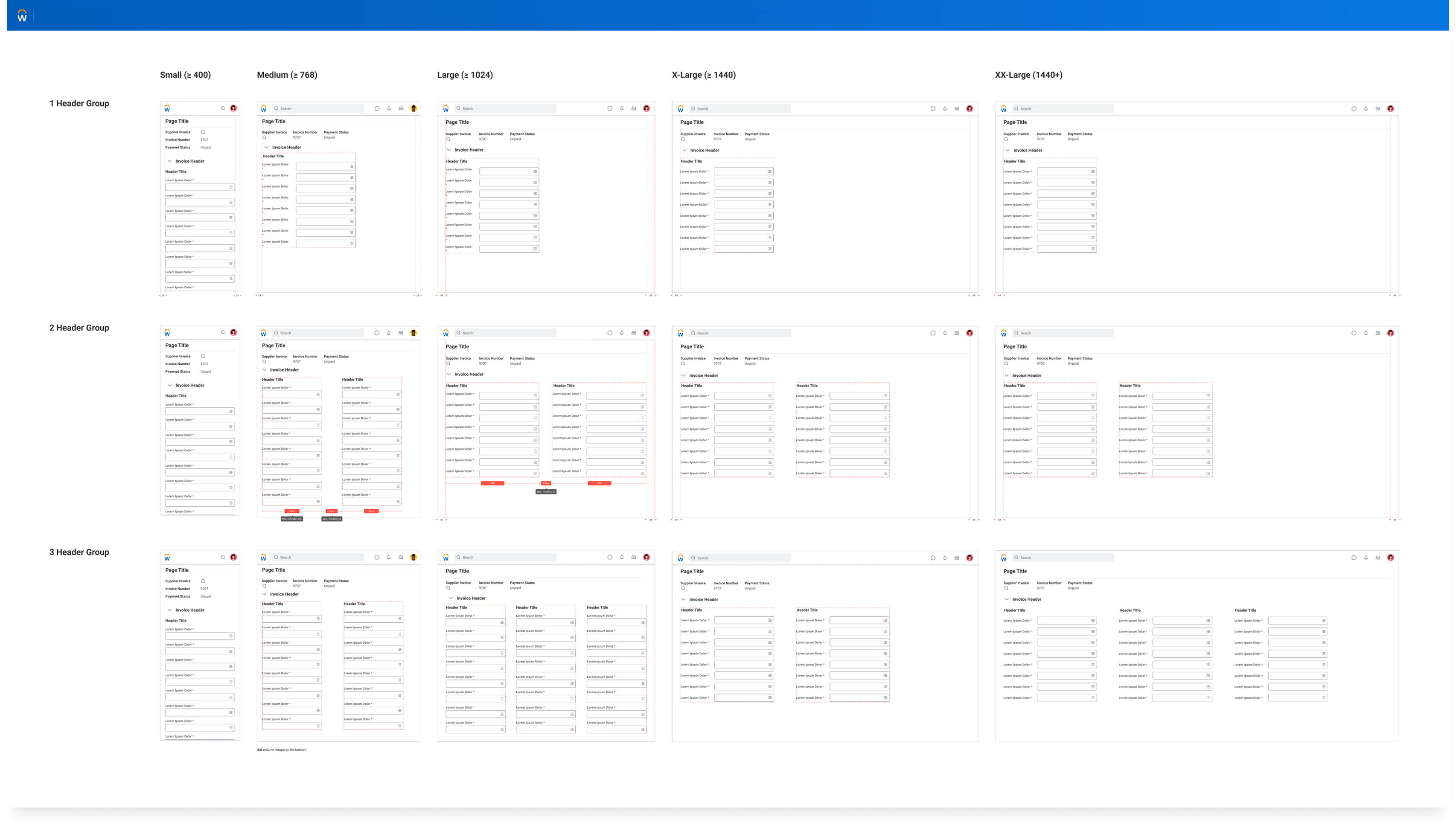
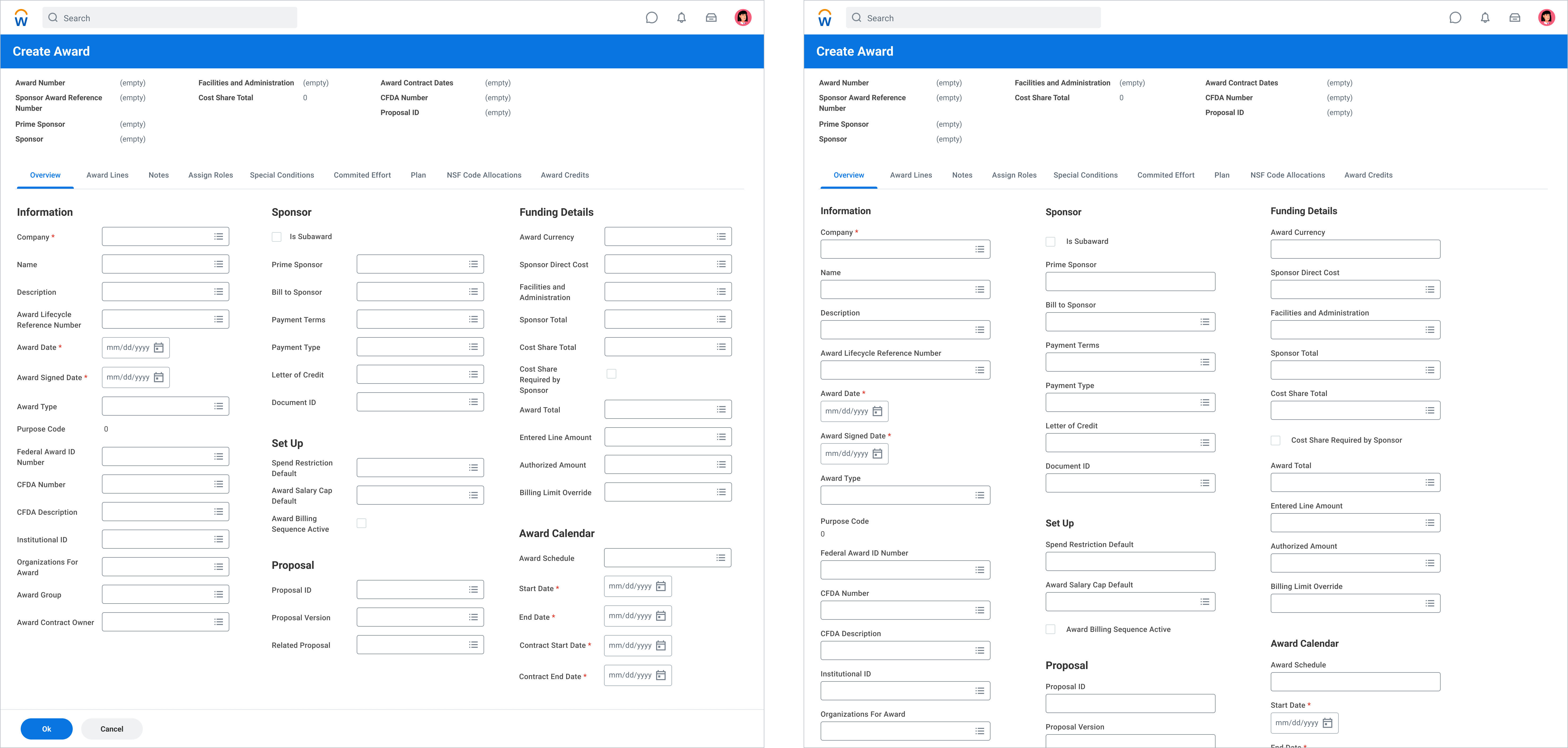
The framework reduced layout fragmentation, increased reuse, and gave teams a clearer path to implement forms without solving the same structural problems again.

Why It Matters

This changed how teams built product, not just how one form looked.

Instead of designing layouts from scratch, teams could build within a shared model. That shifted the work from one-off UI cleanup to system leverage that could scale across product areas.

Case Study 02

Case Study 2: Suggestive Prompt → Selection Framework

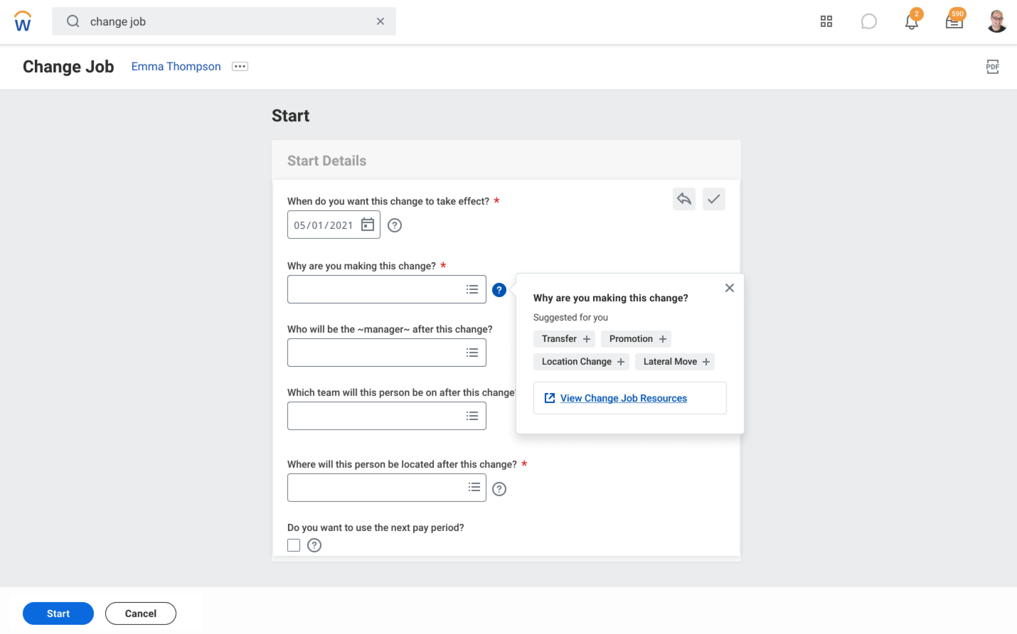
A fast ML-driven problem solved under tight delivery constraints, then expanded into a more intuitive search and selection model that could scale across Workday without relying on one-off solutions.

Context

An ML-driven experience had to ship in under two months

The immediate need was a lightweight suggestion interaction, but teams really needed a more familiar search entry point that could scale into richer selection when the data became more complex.

Fragmented selection pattern versions across product workflows
Constraint

Minimal engineering lift was non-negotiable

The solution had to move quickly, which made reuse, search-first behavior, and extension much more important than inventing a net-new component family.

Delivery conditionThe initial solution had to work within existing system primitives while still opening a broader architectural path.

Insight

The interaction needed a clearer search front door

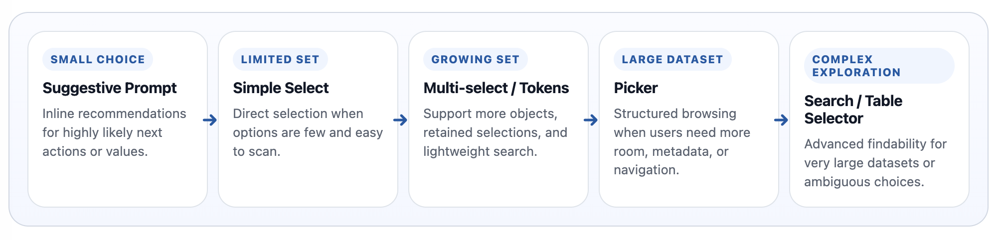
Once the prompt touched real workflows, it became clear teams needed a more intuitive search-first model: type-ahead for likely matches, auto-complete for known objects, and structured selection only when the data demanded it.

Key Decision

Start with a familiar search-first entry point

I pushed to complete Suggestive Prompt with minimal lift, then extend that work into a clearer search and selection framework shaped by data density, complexity, and repeatability across flows.

Case Study Walkthrough

How Suggestive Prompt was completed first, then expanded into a broader search and selection framework

Act 1 Discovery

I started by proving that the platform had too many ways to make a selection. The goal was to show the issue was not one component, but a repeated structural pattern across product workflows.

  • Audited where employees, organizations, financial objects, permissions, and records were being selected.
  • Documented how teams were relying on dropdowns, modal pickers, search dialogs, token inputs, tables, and checklists.
  • Created talking points and review artifacts that made the duplication visible to partners.
Audit view showing empty folders and fragmented selection structures
01 Platform pattern audit Selection structures and dead-end organization patterns surfaced during the broader audit.
Workshop board used to frame selection duplication across teams
02 Collaboration board Workshop artifacts used to make duplication and ownership questions visible to partners.
Workshop examples showing repeated workflows solved with different selection patterns
03 Repeated workflow examples Examples showing the same selection job being solved with different UX patterns across workflows.
Act 2 Suggestive Prompt solution

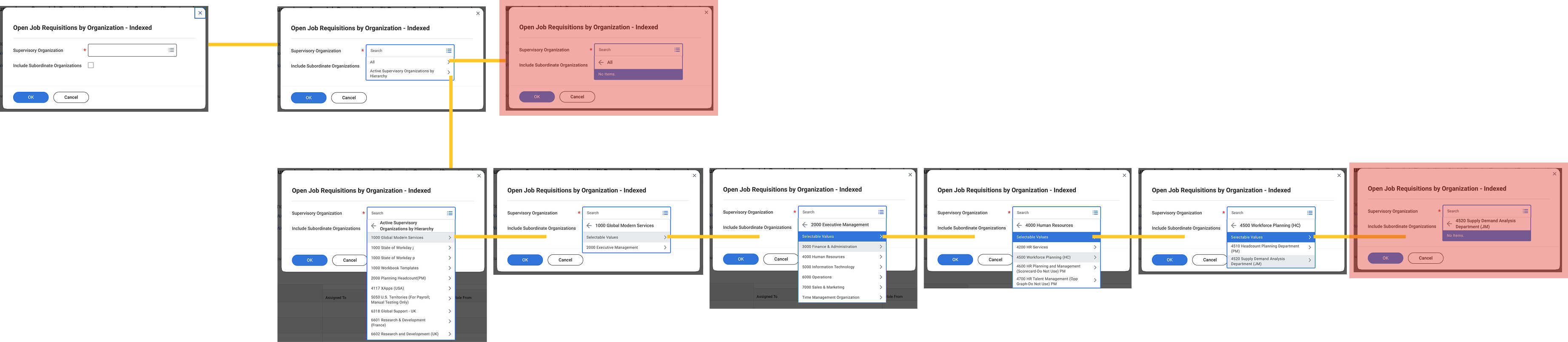
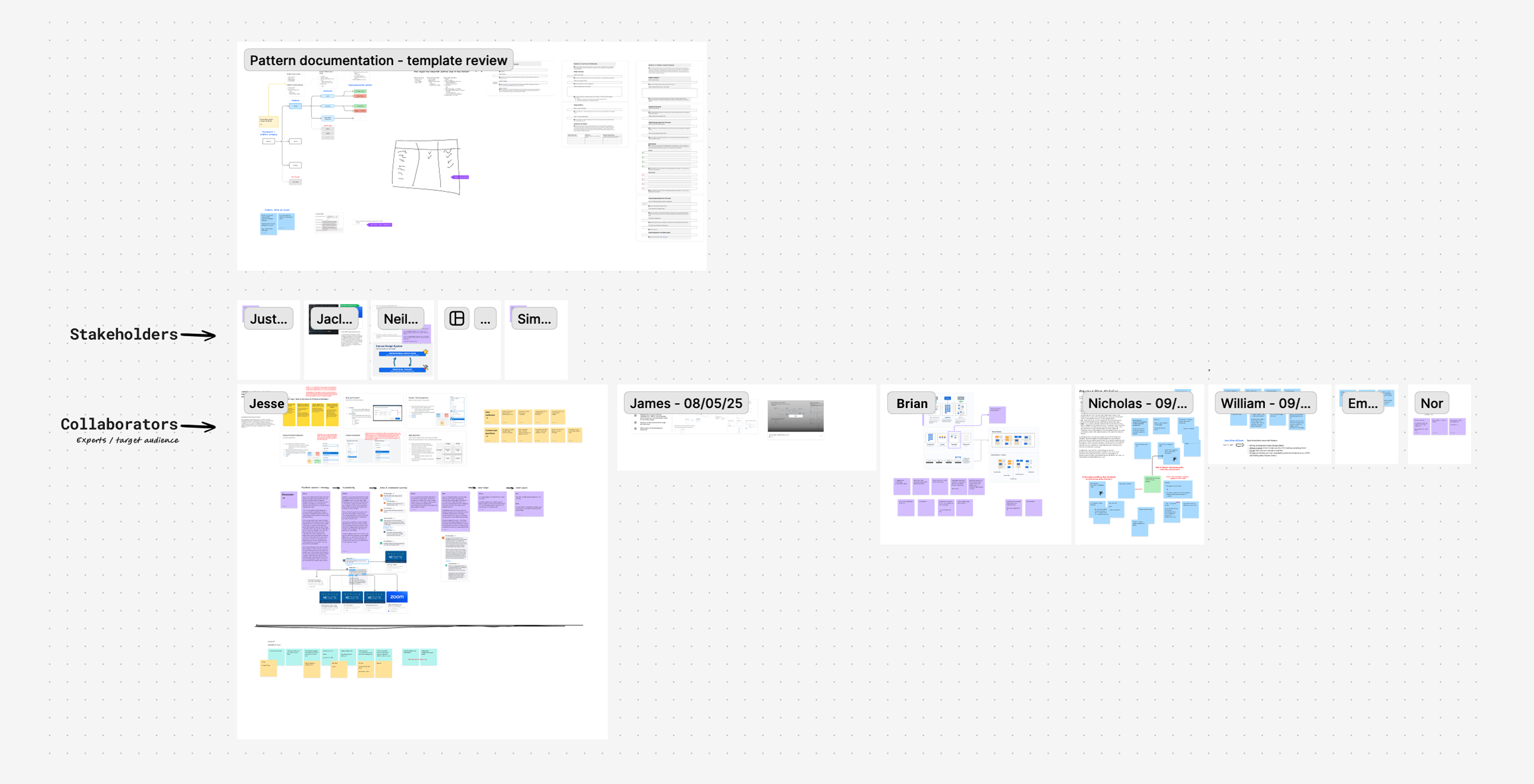
After the discovery work, I solved the immediate product need through Suggestive Prompt. That work completed the local solution, but it also surfaced a bigger question about how a more traditional search experience should scale across the platform.

  • Defined where Suggestive Prompt was genuinely the right lightweight interaction.
  • Validated a more familiar search-first entry through lightweight type-ahead and auto-complete behavior.
  • Used the completed prompt work to show where the remaining selection gaps still required a broader system model.
Prompt completion mock for journal lines
05 Prompt completion Journal lines
Prompt completion mock for job change
05 Prompt completion Job change
Prompt completion mock for quick tips
05 Prompt completion Quick tips
Framework signal image showing how the prompt work pointed toward a broader model
06 Framework signal Once the prompt was solved, it became clear teams still needed standard guidance for type-ahead, auto-complete, and richer selection patterns.
Act 3 Search and Selection Framework guidance

With Suggestive Prompt completed, the work shifted into a broader search and selection framework. This step clarified when teams should use type-ahead, auto-complete, tokenized selection, or more structured browse patterns.

  • Documented overlaps across Canvas, WD-C, and standard tooling offerings after the prompt solution was already in hand.
  • Clarified when a simple search should stay lightweight versus expand into structured selection or picker behavior.
  • Positioned the framework as the path forward for future AI-assisted, search-led, or high-density selection behavior.
Offering comparison visual across Canvas, WD-C, and related tooling
07 Offering comparison Visual comparison used to clarify overlap and positioning across Canvas, WD-C, and adjacent tooling.
Canvas support guidance used to reinforce recommendation patterns
08 Recommendations Recommendations that surfaced shared opportunity between Canvas and UI Platform, increasing Design System adoption while simplifying the design and development repository landscape.
Future-facing prompt guidance showing data-density selection progression
09 Future-facing prompt guidance Guidance that gave product teams a clearer decision between type-ahead, auto-complete, and more complex structured selection patterns.
Documentation and forms artifact used to support the broader selection framework
10 Documentation support UX recommendation artifact used to align design and development organizations around the effort and make the broader framework direction possible.
Recommended selection framework image used to support the framework details
Recommended pattern visual used to connect the framework guidance back to a concrete product-facing selection solution.
Framework details

How the prompt solution became a broader search-first framework

  • Shipped the prompt solution first to meet the deadline.
  • Used that work to expose the broader search and selection gap across flows.
  • Defined where type-ahead and auto-complete were enough, and where dense data needed more structure.
  • Turned a one-off ML feature into a reusable search and selection framework direction.
3
Selection offerings unified under a single Platform-maintained, Canvas-supported repository.
1
Shared decision model for product teams, based on data complexity and scale.
15%
Increase in Canvas token adoption across the UI Platform.
8
Component deprecation paths established to reduce fragmentation and support long-term maintenance.
Impact

A one-off prompt problem became a broader platform pattern.

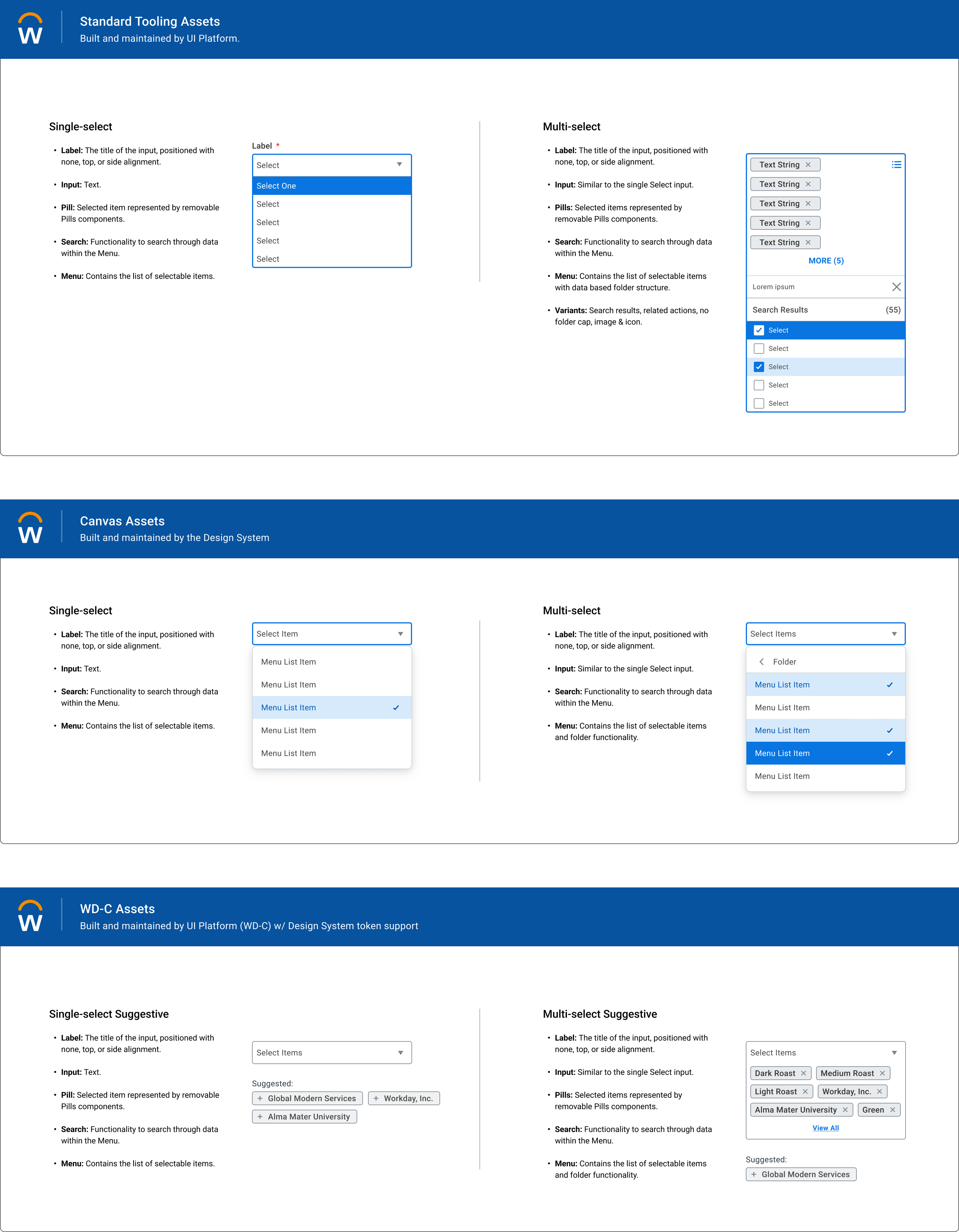
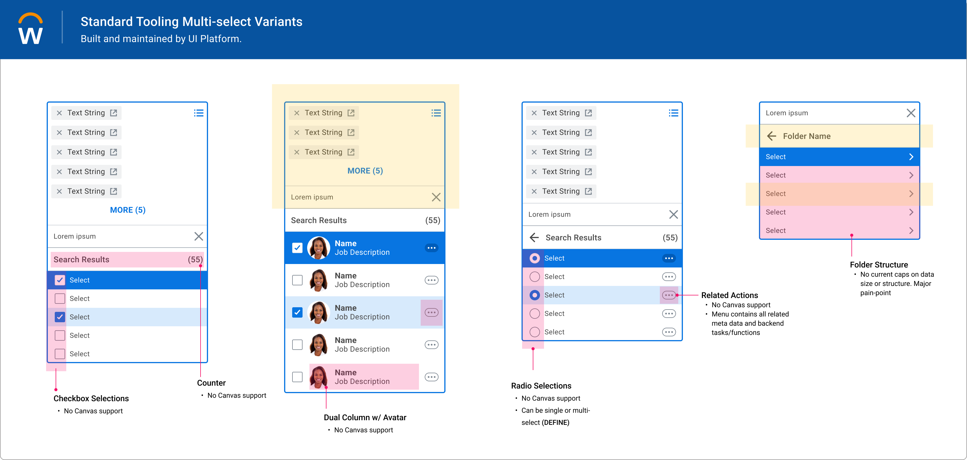
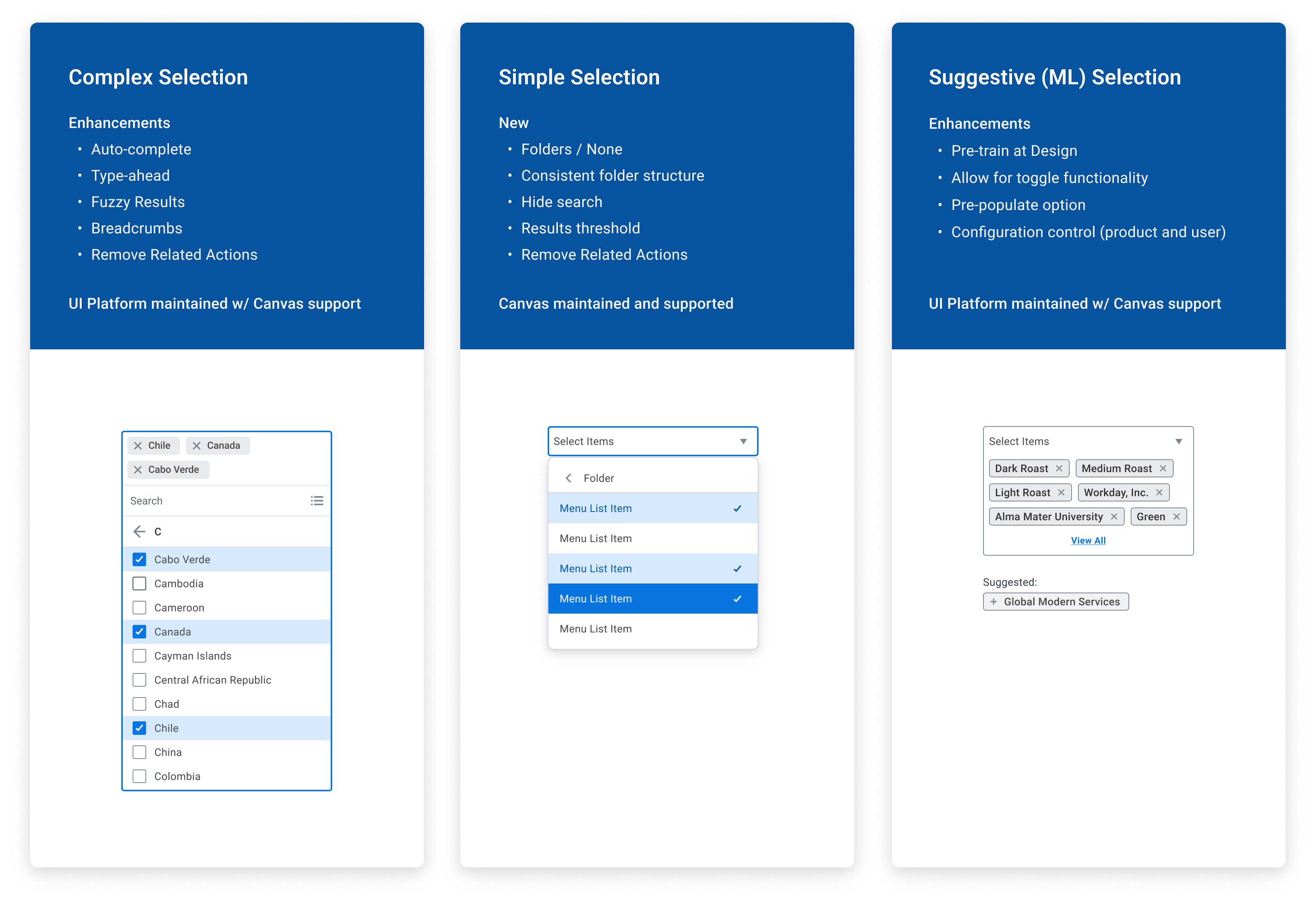
The work reduced the need for custom search solutions, clarified how search and selection should scale, and created a more repeatable model teams could carry into future flows.

Why It Matters

This was not just a feature. It established a system-level direction.

The real value was defining when a lightweight suggestion is enough, when dense data needs more structure, and how those decisions stay consistent across product contexts.

Frameworks & Closing

Across the work, the throughline is turning fragmented product experiences into scalable systems.

Not by adding more components, but by defining the right constraints. The work I do best is identifying patterns that should exist, defining how they scale, and driving adoption across teams.

Capability 01

Campaign Management

  • Send Message Enhancement
  • Document Generation Framework
  • Survey creation
Capability 02

List Detail Functionality

  • Inbox functionality
  • Notification Architecture
Capability 03

Business Process Framework

  • Parallel step functionality
Capability 04

Page Builder Platform

  • Expression & Loop builder
  • Flow builder
  • App Creation Dashboard
  • UX investment model
Capability 05

Configurable Security

Worked inside a structural permissions framework where architecture clarity and product usability were tightly linked.

Capability 06

Implementation Home

Connected platform structure to onboarding and implementation guidance so customers had clearer entry points into setup and configuration.

System-level throughline

The work I do best sits above the individual screen.

  • Identify patterns that should exist
  • Define how those patterns scale
  • Drive adoption across product teams
  • Reduce variability through the right constraints
Closing

That’s the work I’m excited to continue doing.

What continues to pull me toward architecture and systems design is the chance to make product teams more effective by giving them better primitives, clearer choices, and a stronger path to reuse. That’s the throughline of my work: defining systems that scale across teams, reduce one-off work, and turn platform decisions into product impact.